An ATM company is a fun and rewarding business venture, but it takes more than just great business skills to succeed. A large part of owning an ATM company is creating a recognizable brand that will help customers remember your business and come back for more. And one key element of any strong brand identity is a well-designed logo. Equally important is choosing the right name for your ATM business, which sets the tone for your brand and helps in establishing a strong presence in the market.
If you’re not a professional graphic designer, creating a logo for your ATM company may seem like a daunting task. But don’t worry, it’s not as difficult as it seems! In this article, we’ll provide tools for you to create an ATM logo that’s both unique and eye-catching. Plus, we’ve included some examples of great ATM logos to give you some inspiration.
Tools You Can Use To Create a Modern ATM Logo
- Adobe Photoshop: If you’re serious about graphic design, then you need to be proficient in Photoshop. It’s the industry-leading software for creating stunning visual graphics, and it will be essential for crafting a professional logo.
- Canva: Not everyone is a skilled Photoshop user, but that doesn’t mean you can’t create a beautiful logo. Canva is a user-friendly online platform that offers pre-made templates and easy-to-use design tools. Plus, it’s free to sign up!
- Hire a Professional: If you don’t have the time or skill to design a logo yourself, then consider hiring a professional graphic designer. Professional designers are always a safe bet to ensure that your logo looks polished and professional.
- Free ATM Logo Maker: There are several websites available that require just a few clicks to create a basic logo. However, these logos often look generic and lack the customization options that you need to make your mark.
Now that you have some tools and inspiration, it’s time to start designing your own ATM logo! Use the tips below to guide you through the process.
Tips for Creating an ATM Logo
Here are some tips to keep in mind as you create your ATM logo.
- Keep it simple: A complex logo will be difficult to remember and may appear too busy. Stick to a simple design that will be easy to recognize.
- Use typography: Typography can be a powerful tool for ATM logos. Choose a font that reflects the style of your ATM company and use it in a clever way to create an eye-catching logo with your tagline.
- Use images wisely: Images can help convey the mood and style of your ATM company, but be careful not to overload your logo with too many visuals. Try to use one or two images that are strongly associated with products and/or services.
- Be creative: The best ATM logos are unique and memorable, so don’t be afraid to get creative with your design! Try using unexpected colors or shapes to set your logo apart from the competition.
- Convey the feeling of your brand: A great ATM logo should perfectly reflect the feeling of your overall branding. When designing your logo, think about the overall tone of your ATM company. Is it playful and fun? Elegant and sophisticated? Traditional and old-fashioned? The feeling you want to convey will help guide your design decisions.
Examples of Five Great ATM Logos
Now that you know the basics of logo design, it’s time to get inspired! Check out these five examples of amazing ATM logos.
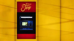
- Wells Fargo ATM: This logo perfectly represents the feeling of the Wells Fargo brand. The simple yellow and red color scheme is eye-catching and easy to remember. And the image of an ATM machine is a clever way to convey what the company does.
- Chase ATM: The Chase ATM logo is another great example of using typography in a logo design. The thick, block letters are easy to read and immediately convey a feeling of stability and trustworthiness.
- USAA ATM: The USAA ATM logo is clean and modern, perfectly reflecting the company’s updated branding. We love the simple image of an ATM machine against a blue background—it’s both stylish and easy to remember.
- Citibank ATM: Citibank’s ATM logo perfectly captures the feeling of the brand. The bright white color is associated with energy and excitement, while the sleek, modern font conveys a feeling of progressiveness.
- Bank of America ATM: Bank of America’s ATM logo is classic and straightforward. The use of red, white, and blue communicates a feeling of patriotism, while the simple image of an ATM machine is easy to remember.
Where To Use Your ATM Logo
Your ATM logo can be used on a variety of marketing materials, both online and offline. Here are some ideas for how to use your logo to promote your business.
- Website: Use your logo on your website to create a cohesive and professional appearance. Be sure to use a high-resolution version of your logo so it looks sharp on all devices.
- Business cards: Include your logo on your business cards to make a strong first impression. You can also get creative with the design of your business cards—use die-cut shapes or unique materials to make them stand out from the rest.
- Print marketing materials: Incorporate your logo into any print marketing materials you create, such as flyers, brochures, and postcards. A well-designed print piece will help grab attention and make a lasting impression.
- Social media: Use your logo on social media platforms such as Facebook, Twitter, and Instagram. A strong social media presence will help you reach a wider audience and generate more leads.
By using your logo on a variety of marketing materials, you can increase brand awareness and get more customers.
Conclusion
Creating a logo for your ATM business is a fun and creative process, but it’s important to keep in mind the tips and tricks we’ve shared if you want your ATM logo to be successful. With a little effort and some outside-the-box thinking, you can create the perfect logo that perfectly represents your ATM and leaves a lasting impression on your customers.


